Selections from Graphis Design Annual 1999
One of my special interests is vintage art and design catalogs - essentially giant books from before online directories and search engines existed that you would comb through if you were looking for an artist or design firm for a commission. Every now and then, I’ll come upon one at a used book store or an estate sale. This book in particular that I’m writing about - Graphis Design Annual 1999 - was purchased at an estate sale I went to several years ago from a guy who used to be a news photographer. His house was an unsuspecting little bungalow in Morningside, but when you stepped through the front door, you felt as if you were stepping into an ‘80s Broadway × Miami Vice coke lounge. I was so thoroughly impressed with what he had done with the place that when I learned he was still alive and helping run the sale, I immediately sought him out to compliment his vision. At the end of our unexpectedly lengthy conversation, he threw in a few design catalogs to my purchase for free, Graphis Design Annual being one of them.
These catalogs fascinate me because they’re perfect snapshots of the landscape of consumer aesthetics at any given time, being products of consumerism designed for the facilitation of further consumerism. Often times, they’re the last remaining documents of ads that were shown for only a few weeks, products that were on the market for only a few months, and design agencies and companies that were only around for a few years. Decontextualized from the time in which they originated (and by extension its contemporaneous sociopolitical and economic conditions), they are rendered completely ineffective as corporate propaganda, and instead take on an almost romantic quality - the kind that only bygone relics can impart. Here are five entries that stood out to me, in no particular order.
1. Commission for Novellus Systems, Inc. by Larsen Design + Interactive
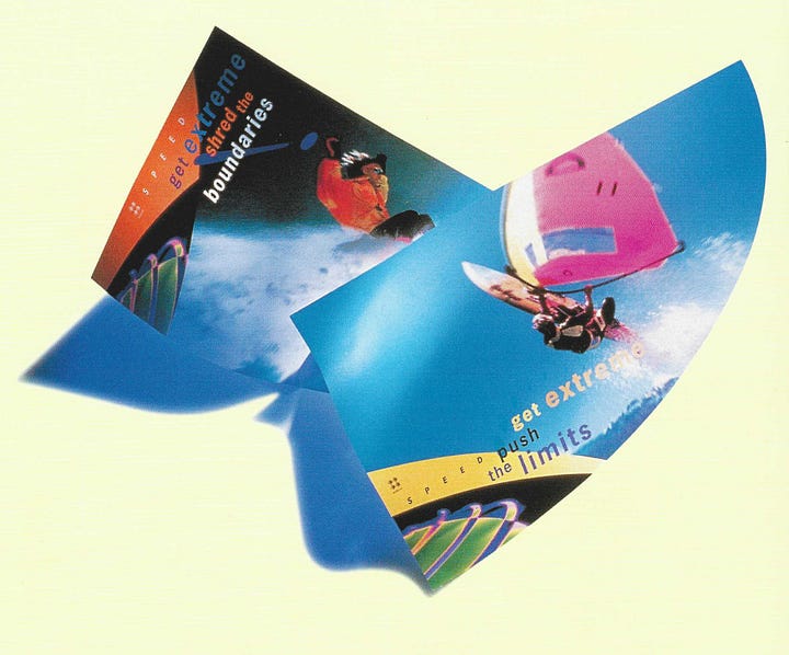
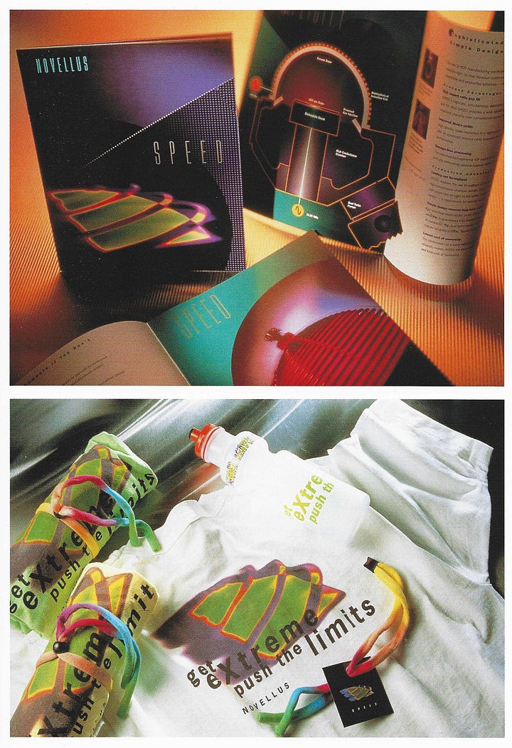
The mid-to-late 1990s saw computational power develop at breakneck speed, and not only that - the computer had started embedding itself into every family room or home office in the United States. No longer was the beige metal cube relegated to corporate offices that had the budget for them - now, practically everyone had enough of an understanding of the role of the computer in their own work and life that marketing agencies needed to rethink their marketing campaigns.
In the past, marketing electronics was more straightforward: you were advertising in specialty magazines like Computer Shopper, for a demographic that would understand off the bat what it meant when you were advertising, for example, an “Amiga 500, memory expandable to 1 megabyte via A501 RAM expansion cartridge, ROM-resident v1.2 Kickstart kernel, includes two-button opto-mechanical mouse.” The ubiquity of the computer meant a broader market, but also meant that a larger proportion of your audience would not necessarily understand the difference between, say, a 180 MHz Intel Pentium Pro and a 166 MHz AMD K6.
So how do you highlight the differences between your product and your competitor’s product without including an info sheet and a short blurb about tech specs in your pitch? One answer: liken it to an extreme sport, like parasailing or snowboarding. They’re physically challenging activities that demand power and performance. They push the limit - don’t you think the work you do at your desk demands a workstation that pushes the limit too?
To supplement the visuals, a tactile promotional package was put together including t-shirts, sunglasses straps, and water bottles - a strange choice of goods for a company in the semiconductor industry like Novellus, but a move that serves to equate the product and brand to a physical activity and lifestyle. Even if you don’t run, hike, or climb mountains, you’ll need those as you watch your PC furiously chug away at whatever spreadsheet you’re working on.
This is one of two examples I’m dissecting in this article that fall within the Corporate Gen-X Cyber aesthetic, a short-lived aesthetic relegated almost exclusively to the tech sector and developed in order to bridge the gap between the reactionary anti-tech sentiment of Global Village Coffeehouse and the highly progressive futuristic embrace of the Y2K Aesthetic.
2. Commission for KPMG New Zealand by Voice
Safe to say the influence of constructivism has permeated practically every piece of media in the business, economics, and international affairs sectors, and for good reason: they’re both styles that arose from modern industry, for modern industry.
The modern industry of the 1910s and 1920s took the form of factory floors; the modern industry of the 1980s and 1990s took the form of offices, cubicles, and meeting rooms. Factory symbolism gave way to accounting symbolism as manufacturing left the United States and the economy shifted more toward a consumer- and service-based economy. Despite the shift, the desire to engage with a desk-oriented profession as a manual and tactile labor remains; this becomes increasingly difficult as the social stratification of the 1970s onward minimizes blue collar labor and glorifies white collar labor. The notion of using binoculars while jotting down numbers and plugging values into formulas is contrived at best, but think about it this way: by using outdoorsy imagery, recording and crunching numbers are rendered secondary to the primary activity, engaging with the physical world via your physical form. After all, those numbers you’re plugging into formulas have to come from somewhere, and they’re not coming from your desk.
That said: constructivism was, at its core, an austere, proletariat art movement. Finance, banking, and investment publications are decidedly capitalist. There’s something else at play here: the Art Deco revival movement of the Reagan era. While constructivism decried glamor, and opulence, Art Deco embraced it and adapted it for a new era: a gilded one dominated by the rise of skyscrapers, accumulation of personal wealth, and the luxury of modern convenience.
The result is a merger of the two art movements in the 1980s and 1990s that gave birth to aesthetics like Factory Pomo and Deco-Luxe; the evolution of a design language that attempts to bridge the increasing gap between the prole and the capitalist by presenting one as a mere lateral variation of the other rather.
3. Commission for Qualcomm by Mires Design
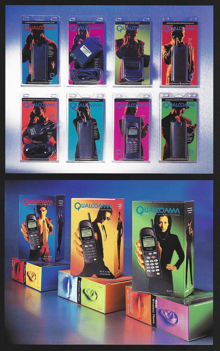

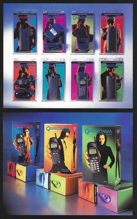
Much like Novellus by Larsen in #1, a sense of physicality and movement is communicated through the use of color and the poses struck by the models on the product’s packaging. Most notable, though, is a more clear attempt to merge the biological with the technological - note the ear, mouth, and hand present on the side of the package. Even in its most primitive form, the idea that the phone and its user would be inextricably intertwined is present; it serves as an enhancement for the senses (or, in its more extreme form, a replacement for the senses).
Note the imagery of the woman holding a flip phone over her eyes - it doesn’t make sense, if you think about it. At this point in time, the cell phone had little in the way of graphical capabilities, and built-in cameras were still years away from being a desired feature. Note, though, that the model has an almost android-like appearance - is this a human being as we understand human beings, or is this someone whose physical form has been upgraded?
The other models on the rest of the packages don’t quite have the same appearance, but there’s an aura of importance about them: dramatic, moody lighting and confident, active poses, as if they’re too busy to slow down and stop moving, even for a portrait. The sense being imparted is that these are people who have been transformed by their cell phone, enabling them to function at a level above those who do not own a cell phone. Ironically, 20 years down the line, that sentiment holds true - but perhaps not in the cool, sleek, chic way we once thought.
4. Assorted Industrial Americana designs


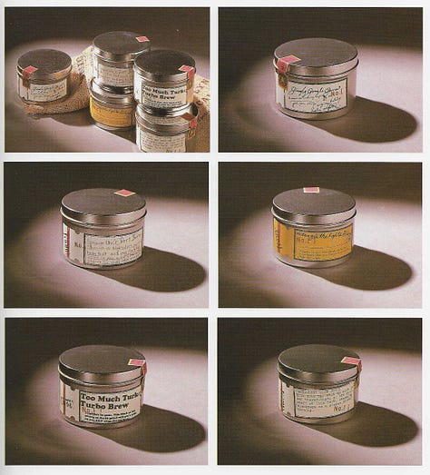
I was rather surprised to find the sheer volume of Industrial Americana products, packaging, ads, and designs throughout the catalog. It seemed that every other design was in the vain of the mid-20th century American vernacular, which came as a surprise: these are visual components approximately 40 years old, about a decade beyond when we can reasonably expect a nostalgia-driven revival. In the modern era, timelines trend toward compression. As information moves faster, so do fads: the ‘80s revival aesthetics of synthwave and vaporwave came 30 years after the decade they copied, and the Y2K revival came less than 25 years after the turn of the millennium. In 2007, the lifecycle of a meme lasted years; in the present, a meme today is dead by tomorrow.
When a style becomes easy to reproduce, its predecessor falls out of vogue and is no longer chic, and thus begins to exit the commercial cycle. When the style becomes the dominant form, it inevitably becomes associated with the innumerable cheap clones that steadily grow their market share, and suddenly its predecessor - whose methods and techniques of production have become a rarity - reemerge in a revival form that is more expensive to produce, and thus associated with higher-shelf goods. Such can be seen with the abundance of imagery, fonts, kerning, and sepia-monochrome color palettes in the provided examples: a hark back to an era of American craftsmanship, where quality and durability were part of the design rather than a premium accessory.
Speaking to the sheer volume, it’s difficult to comprehend how a single aesthetic managed to establish such a widespread presence in this catalog, spanning every single category from letterheads to paper to products to packaging. One would think that it was the dominant aesthetic at the time, based on the sheer supply available. On the contrary, this aesthetic has been more or less relegated to the midpoint of the consumer aesthetics iceberg, being overshadowed by far more popular aesthetics like Global Village Coffeehouse or Utopian Scholastic. I’m not entirely sure by what metrics Graphis decided any given example was worthy of inclusion in their annual review, but this seems to be indicative of a disconnect between what designers like, what their clients like, and what consumers like. Most telling is that, based on currently available resources, the Industrial Americana aesthetic was on its way out by the late 1990s - shortly before this book was published.
5. Commission for Timbuktuu Coffee Bar by Sayles Graphic Design
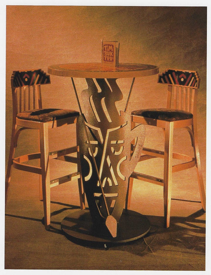
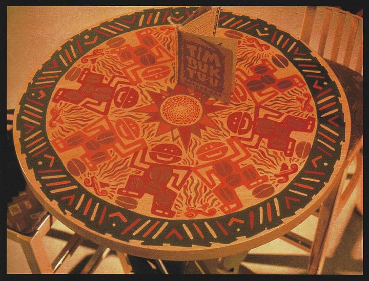
Speaking of Global Village Coffeehouse (a.k.a. GVC), the Timbuktuu Table has been not only one of the most well-known examples, but is the definitive example of GVC in reference material - an impressive feat, considering the sheer breadth of territory GVC covered in popular and consumer culture. As a testament to how truly wide it had spread, the Timbuktuu Table was designed not by a Los Angeles or a New York firm, but rather by a Des Moines, Iowa-based company called Sayles Graphic Design. Currently doing business as J Sayles Design Co., their website’s front page portfolio has several excellent examples of GVC artwork they had produced in the past.
The Timbuktuu Table is a spot-on example of the culturally insensitive nature of Global Village Coffeehouse and its reactionary roots. To rewind a bit, a proper examination of the GVC style requires examining the the world at large during the late 1980s and early 1990s. As noted previously, the accelerated development of consumer technology and the rise of the World Wide Web gave birth to futuristic design movements that imagined a society revolutionized by the computer, to which the organic forms and earthy textures of GVC reacted against. Equally important to note, though, is the West’s shift in attitude toward the very peoples they once enslaved and exploited: no longer commodities to extract wealth from, but the wise proprietors of a mystical, organic, down-to-earth culture, uncorrupted by silicon and solder.
The great irony of the post-colonial, post-civil rights era is that the West’s newfound fascination with developing nations and its subsequent packaging into commodities is, itself, a form of exploitation, coming full circle from the colonial era and then repackaged as un-racist. After all, we’re appreciating these peoples and their customs now, right? GVC is the “I have Black friends” of visual design - and they wear loincloths, throw spears, don’t have electricity, and worship Kokopelli.
On the surface, it seems quite on the nose for a cafe named after an African city that sells an African export to adorn their interior with African imagery, but scratching beneath the surface reveals an uncomfortable truth: it’s stereotyping designed to appeal to a demographic that decidedly has no claim to any of it, marketed as an exotic experience one can partake in from the comfort of their own neighborhood. For starters, Timbuktu is a North African city, coffee is a primarily Central African export, and the motifs expressed through the Timbuktuu Table seem to draw from South African and perhaps even Pacific Island imagery. There’s little cohesion going on here, but you’re only there for a cup of coffee and the ambiance, so don’t think about it too hard.


